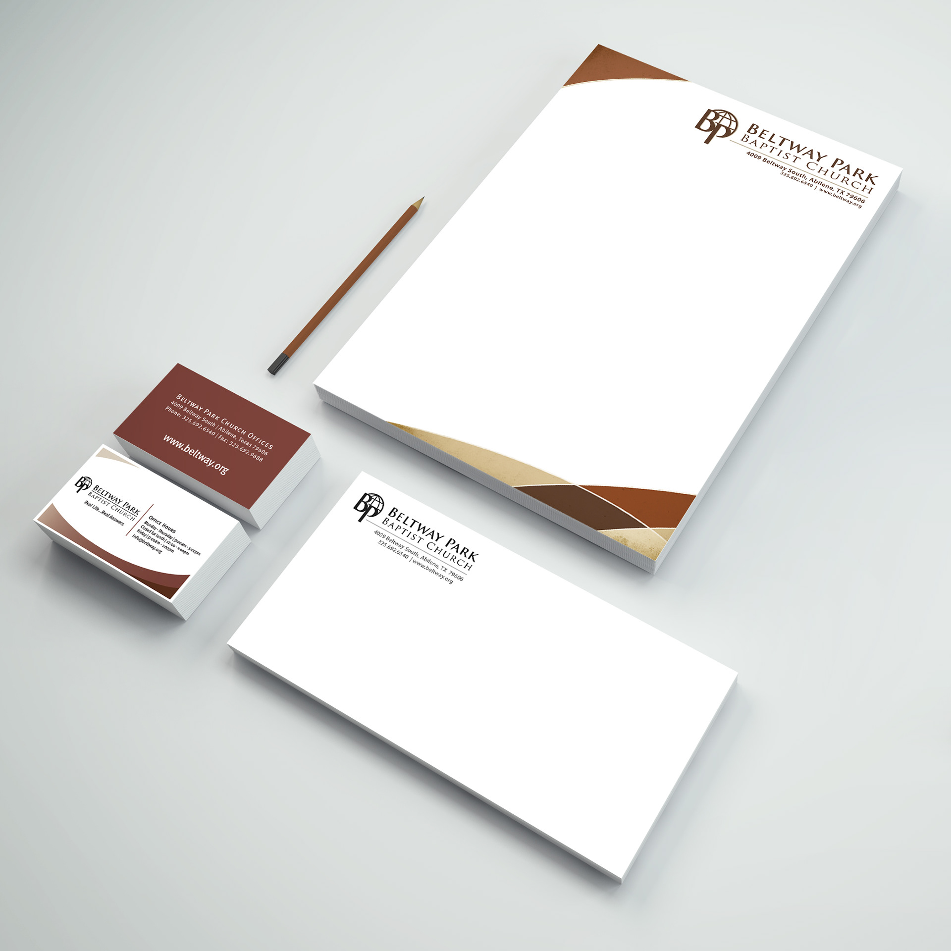
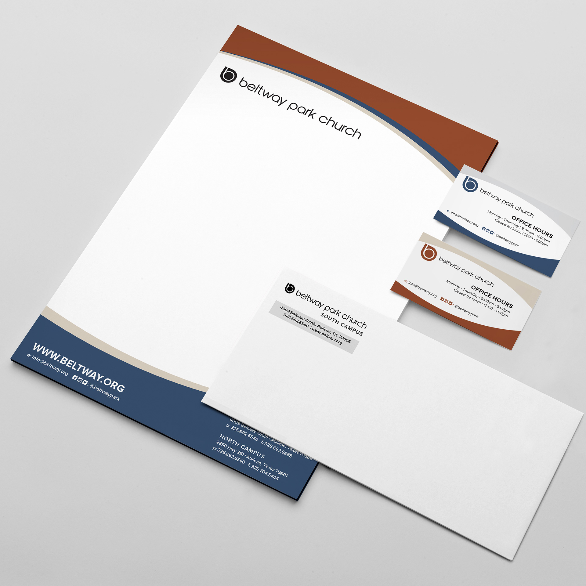
Full branding included letterhead materials - Adobe Illustrator & InDesign
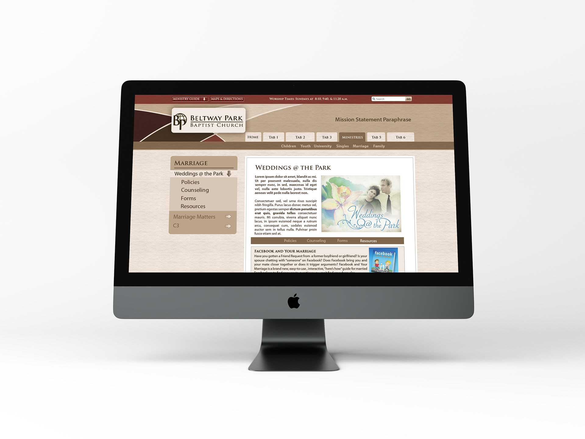
Custom Website Layout - worked with web development teammate in WordPress & Photoshop
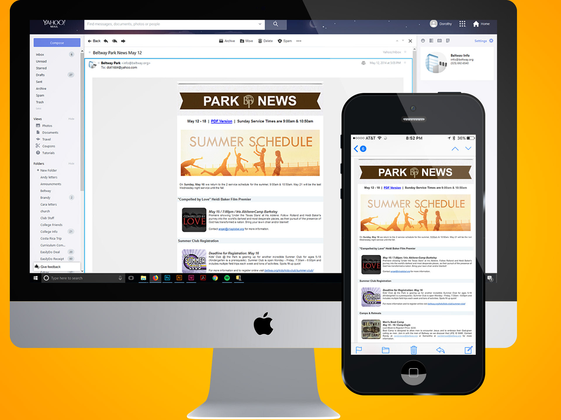
Branded Mass Weekly Email - Constant Contact
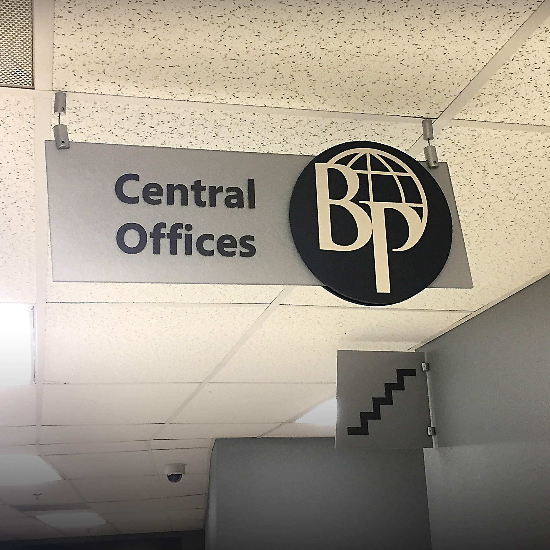
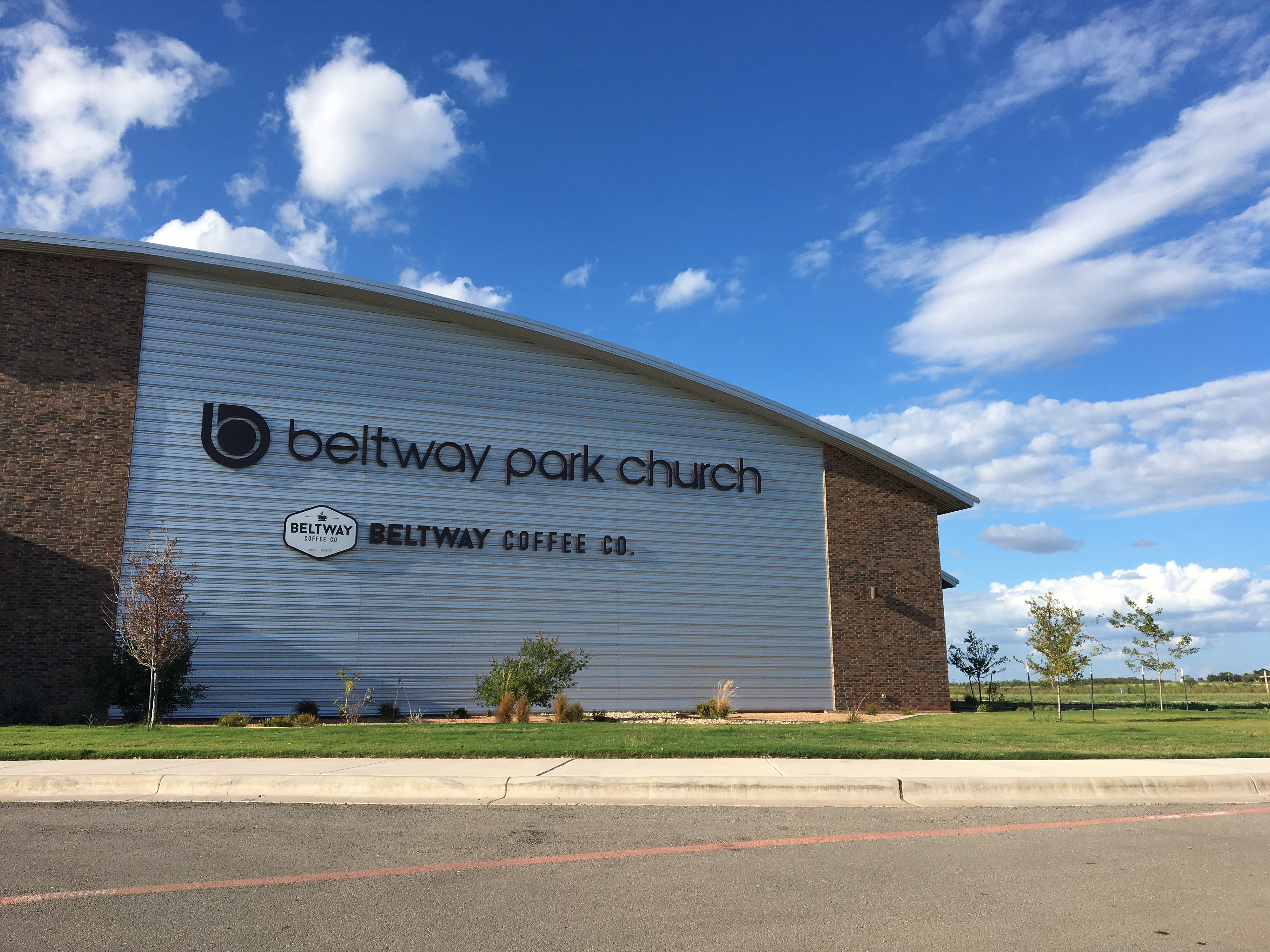
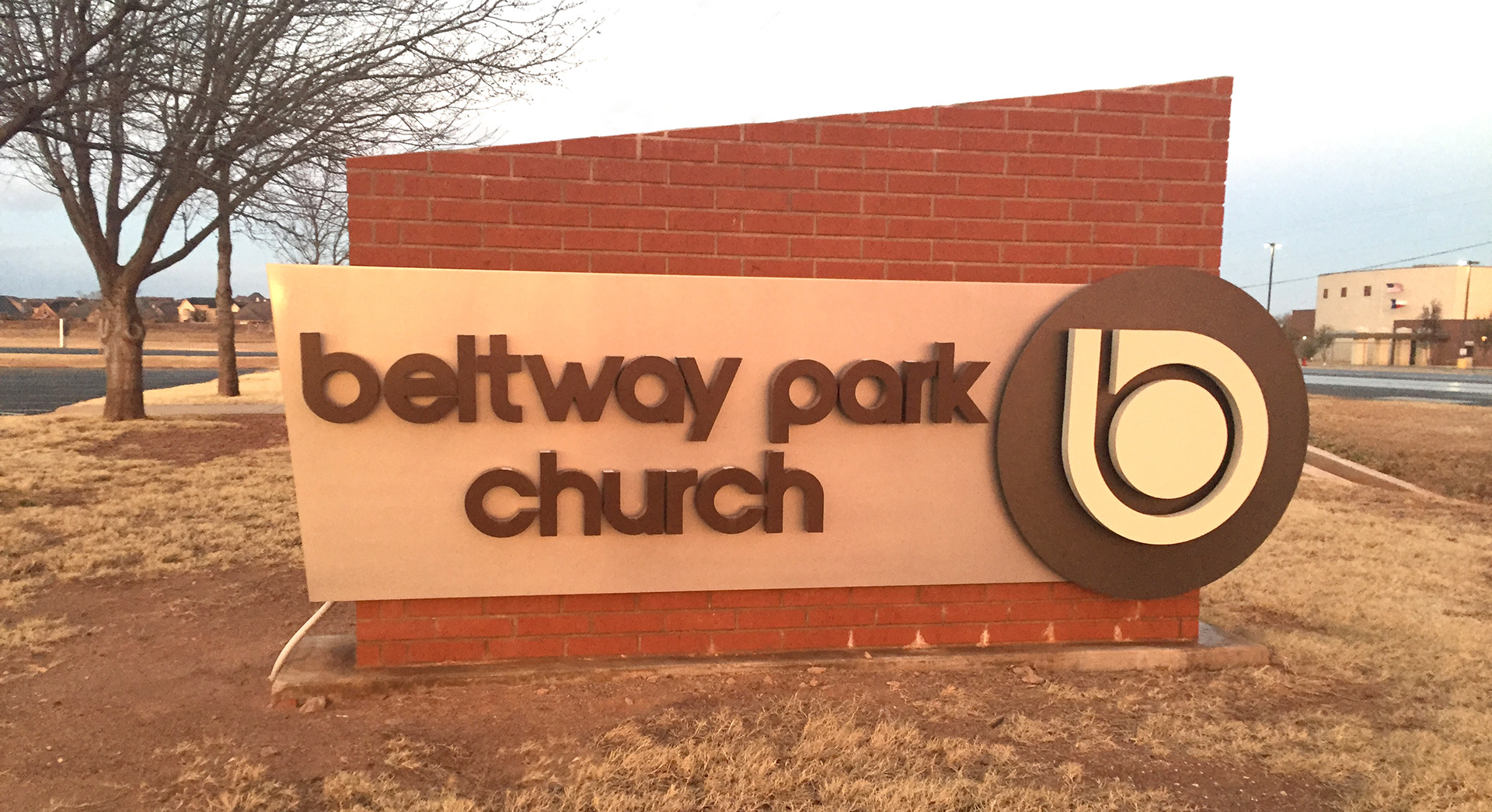
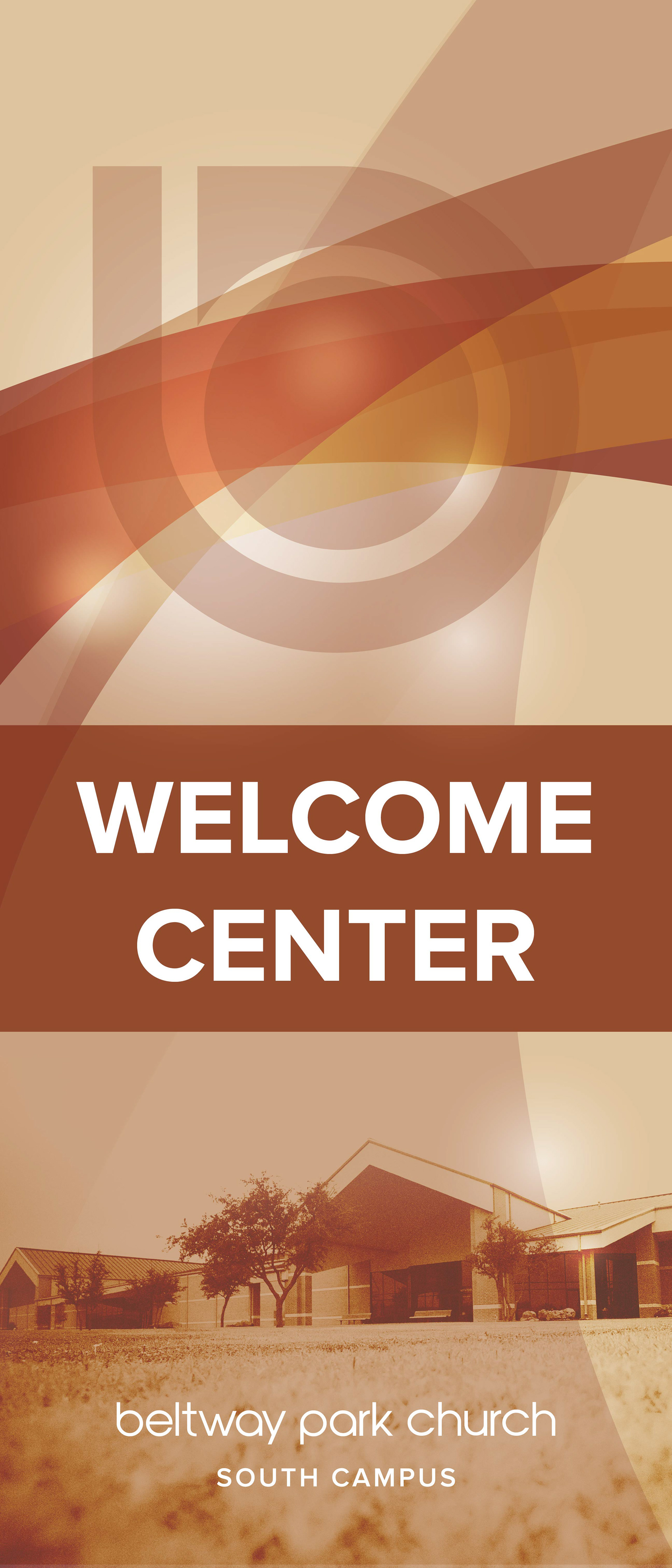
Branded Campus Signage
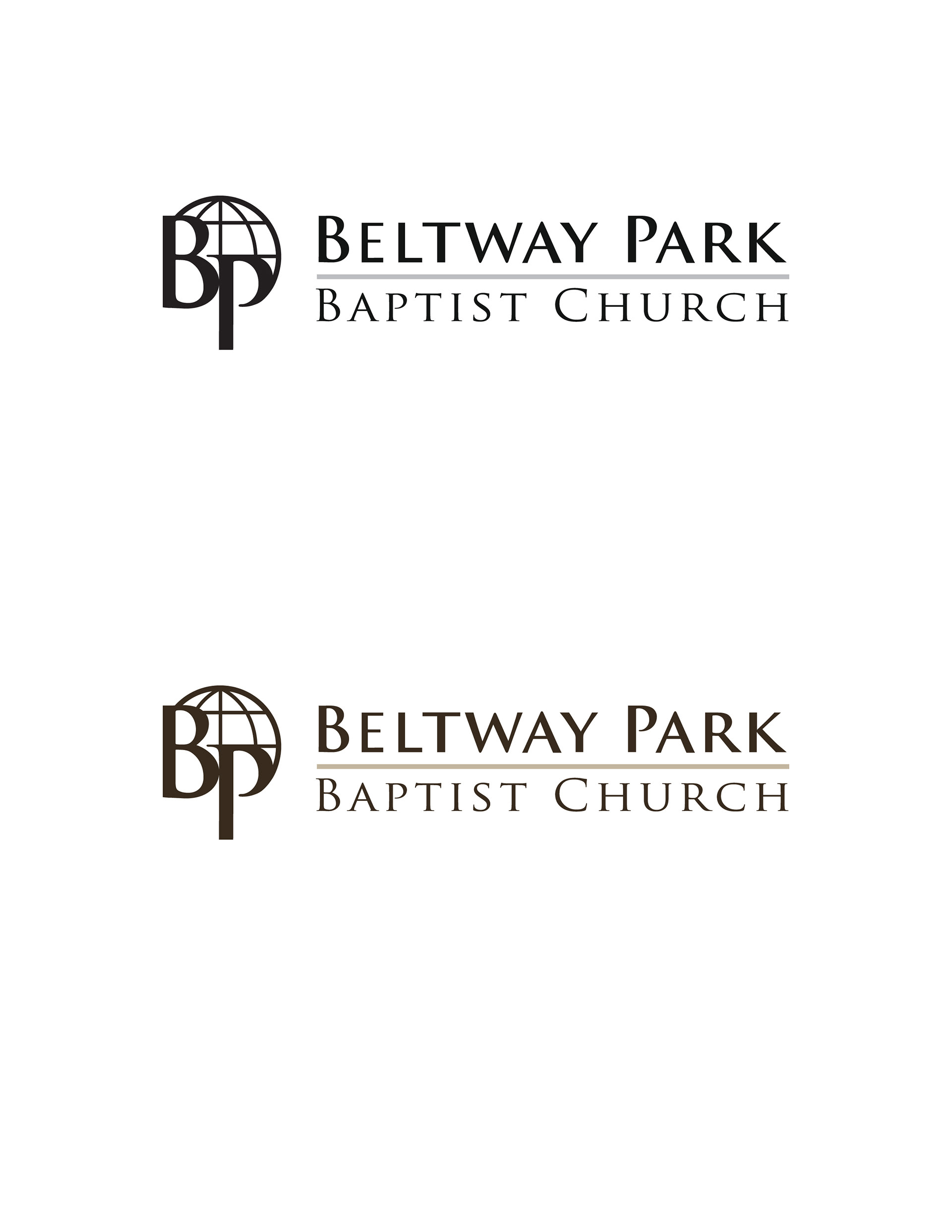
Final Logo - Adobe Illustrator
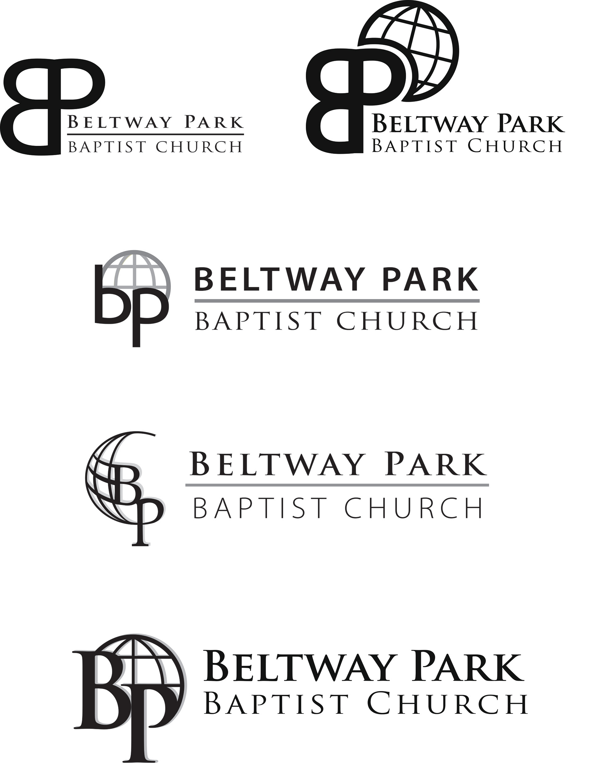
Revision/Brainstorm Process
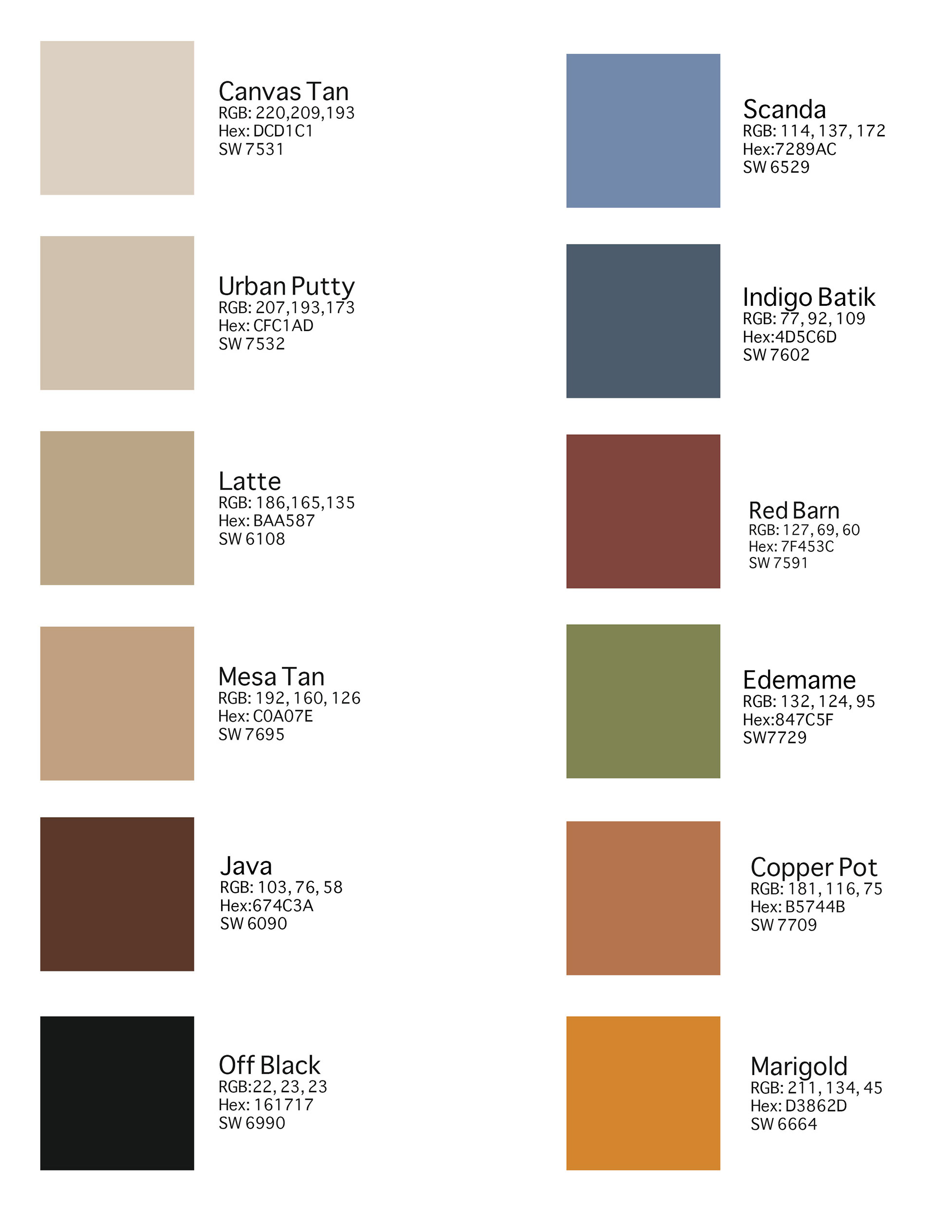
Brand Colors
I worked with Beltway Park Church through rebranding when they had just begun a building campaign to double the size of their first campus and again several years later with the opening of a second campus across town.
The first rebrand focused on the mission orientation of the church as well as desiring to feel warm, welcoming, and comfortable. The aesthetic was also reflective of the red tones in the building's exterior brick and interior paint colors. Brand colors were chosen from Sherwin Williams paint swatches specifically used in portions of the new building and interior design. The selected swatches were then calibrated on the on-campus printer to match the desired Pantone equivalent for color continuity across mediums. Fonts chosen for the branding were structured and classic to give a feeling of being grounded and established.
North Campus Signage
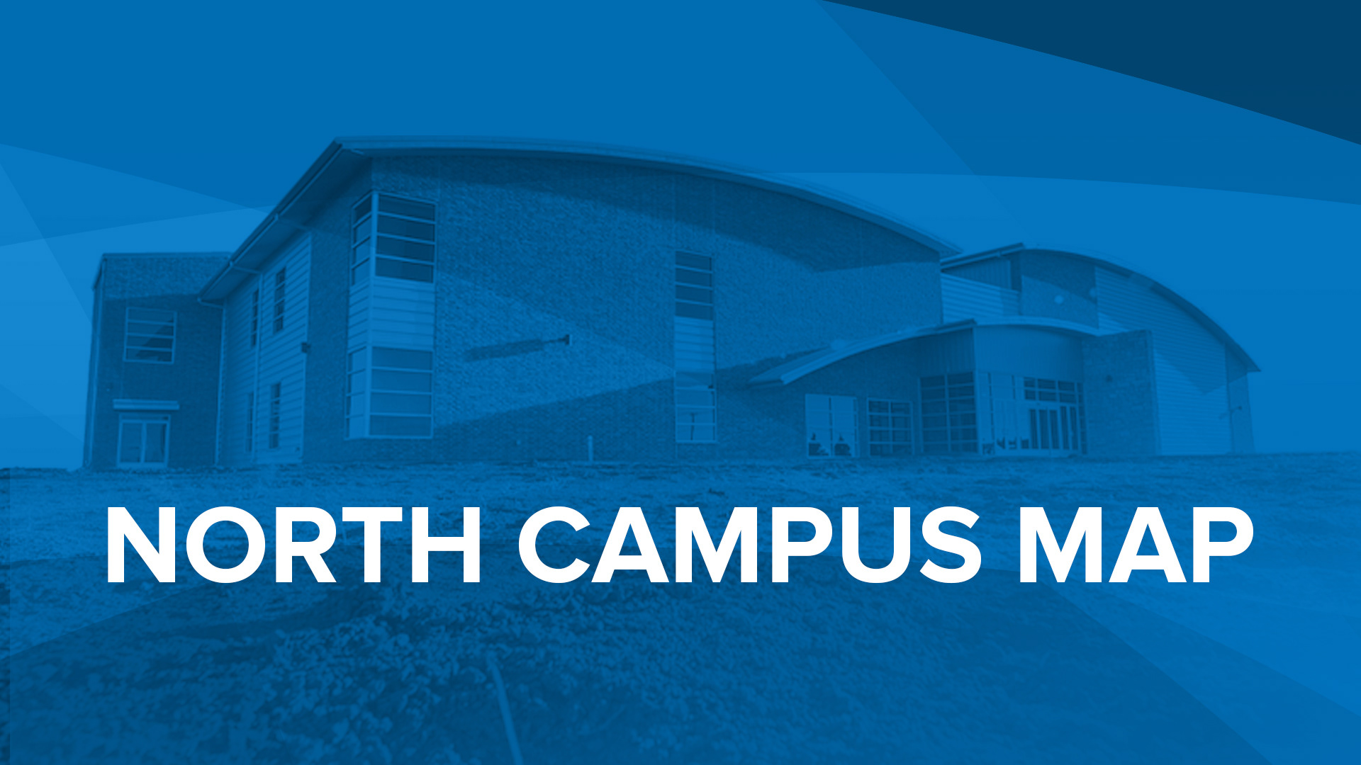
Mobile App Button for North Campus Map
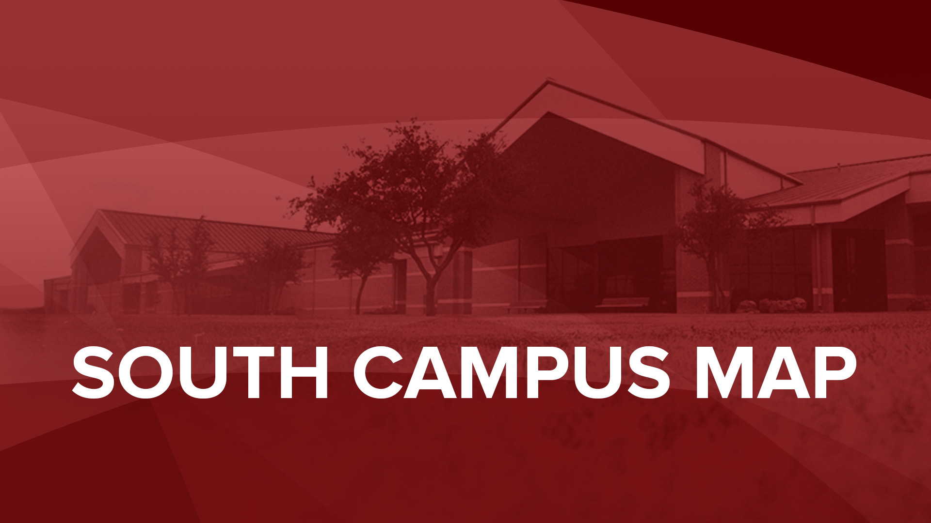
Mobile App Button for South Campus Map
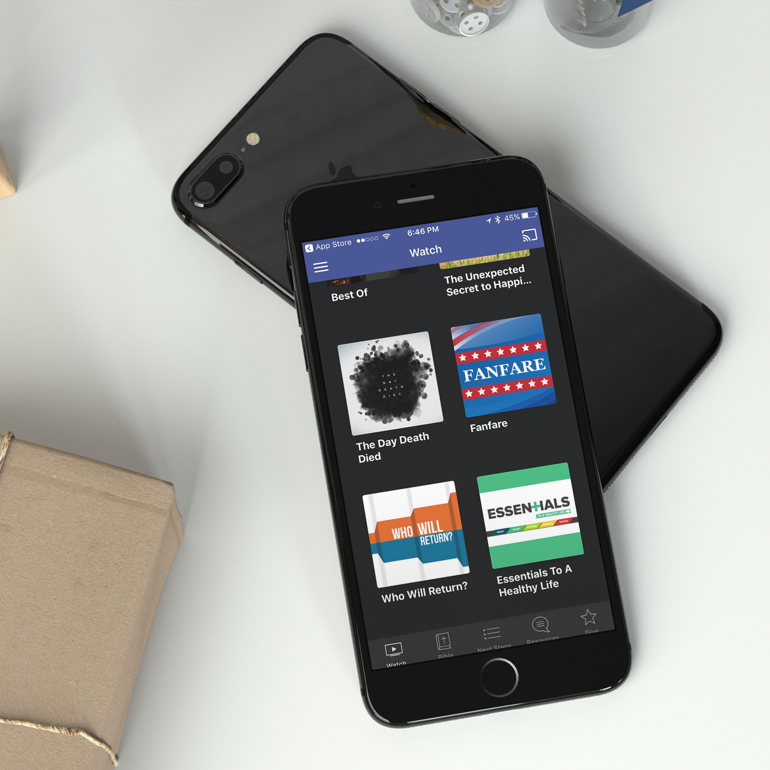
Mobile App Design through Subsplash
The second rebranding needed to incorporate the entire organization while allowing for the unique character of each campus to still be distinct. The original campus wanted to retain their warm, comfortable charm, while the new campus wanted to reach a younger audience with a cool, edgy feel. Through collaborative back and forth, the team and leadership settled on a simplified "b" instead of the previous "BP" and continued the round "globe" feel without the direct representation. Additional imagery Influence was also pulled from the shape of a map pin to again incorporate the missional character of the organization.
Colors, fonts, and logos were created and chosen to fit the dynamics of the specific target audience. Audience driven choices were reflected in interior decorating, print, web, social media, complementing logos, stationary, signage, apparel, name tags, etc. The second rebrand also included the creation of a mobile app through Subsplash.